
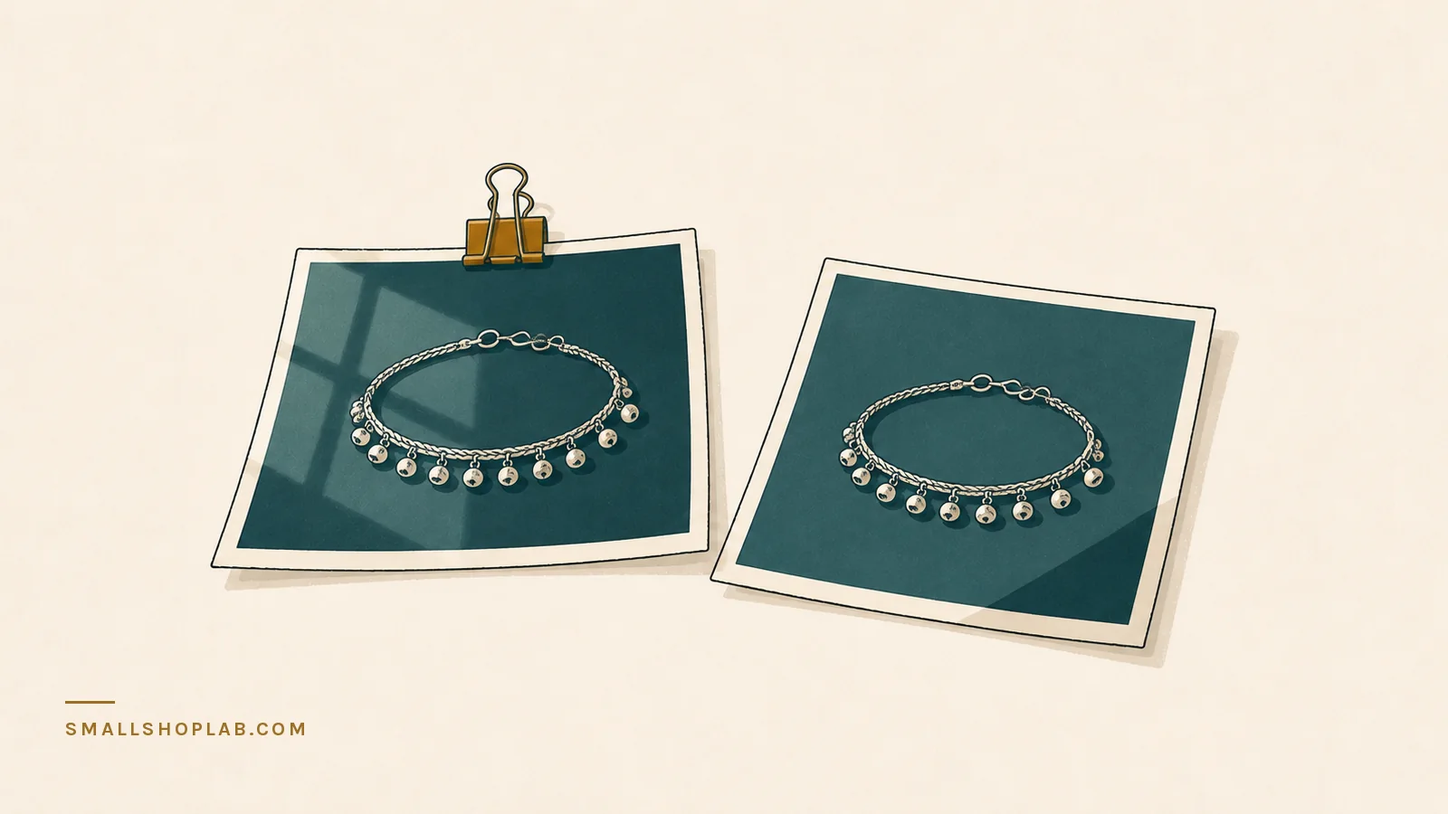
These two photographs are both mine, both taken for real listings, both of silver anklets. One of them sells. The difference between them costs nothing to fix, and it is not the camera.
The two photos
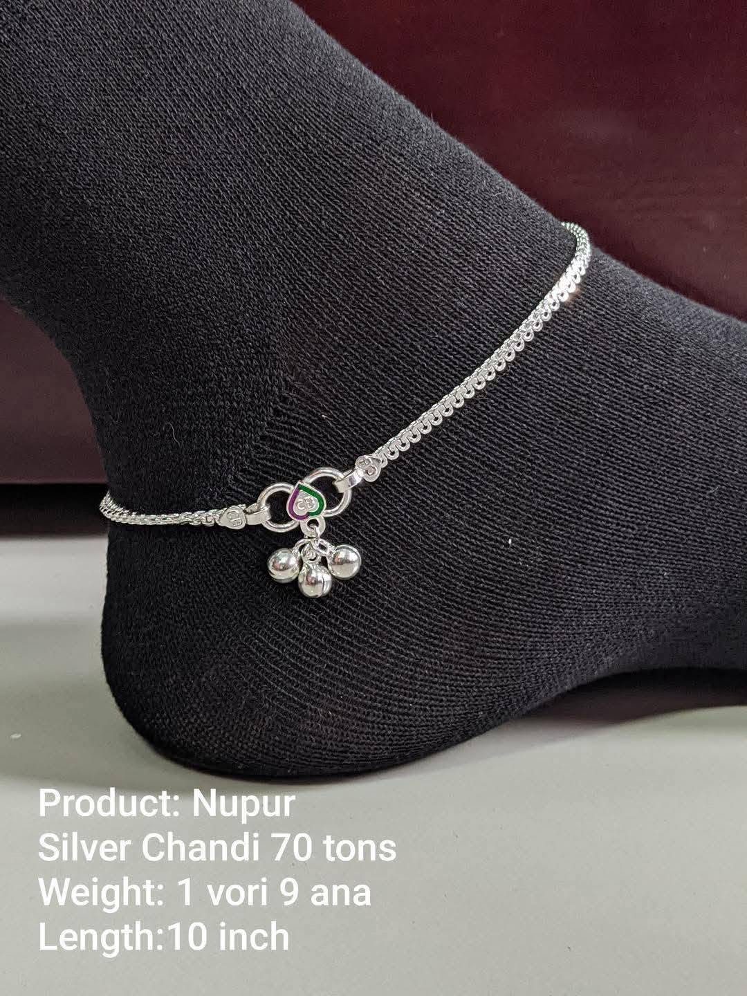
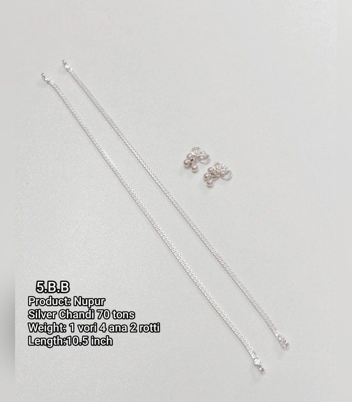
Nothing changed between them except the surface underneath and whether the piece was worn or laid down. No lighting kit, no editing, no better camera.
Rule 1 — never shoot silver on a light background
Silver has almost no colour of its own. It works by contrast: it shows you the edge between a bright reflection and a dark one. Put it on white or pale grey and the bright reflections have nothing to sit against, so the outline dissolves and the chain greys out into the background.
Look at the second photo again. The links are physically there, in focus, correctly exposed — and you still cannot count them. That is not a resolution problem. There is nothing dark for the metal to reflect.
Black cloth costs almost nothing and is the single biggest improvement available to anyone photographing silver. It does more than a $200 lens.
The exception is a marketplace that demands a white background for the first image. Where that’s the rule, shoot the compulsory white one for the thumbnail and make every following image dark — those are the ones people actually study before they buy.
Rule 2 — on a form, never flat
A flat lay tells the buyer the shape of a thing. It does not tell them the size, how it hangs, how it sits on a body, or how it catches light when it moves. Those are the four questions someone actually has before spending money on jewelry.
A form — a bust, a neck stand, a wrist block, even a rolled towel under fabric — answers all four in one frame. It also removes the hardest problem in flat-lay photography, which is scale. Nobody can tell how big an anklet is when it’s lying on an empty table.
This is the change most sellers resist, because a flat lay is easier and looks tidier. Tidy isn’t the goal. Being able to imagine wearing it is the goal.
Rule 3 — the light comes from the side
Metal doesn’t get brighter with more light. It gets more interesting with light coming from an angle, because an angle gives it something to reflect and something to shade against.
Light coming from directly behind the camera — a phone flash, a ring light around the lens, a lamp over your shoulder — hits the metal straight on and bounces straight back. Everything flattens into one grey tone and the piece looks like a scan.
A window at the side does the opposite for free. Not direct sunlight, which is too hard and throws black shadows; ordinary daylight through glass, with the piece a foot or two away and the window off to one side.
The whole setup, drawn
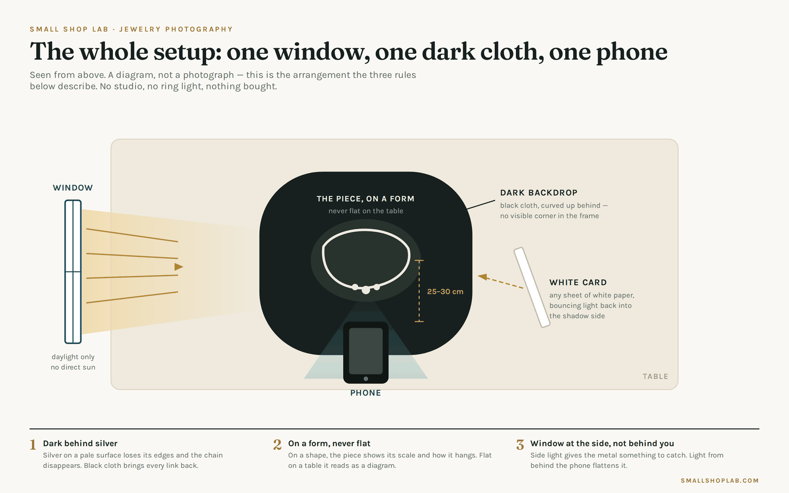
Four things, three of which you already own:
- A window, to one side, no direct sun
- Black cloth, curved up behind the piece so no corner or seam appears in the frame
- A form to hang or drape the piece on
- A sheet of white paper on the shadow side, tilted to bounce light back into the dark half. This is the only thing most people skip, and it is the difference between “dark” and “murky”.
That is the entire kit. There is no fifth item that would make a meaningful difference at this stage.
What I got wrong for a long time
I have listed and photographed more than 400 one-of-a-kind pieces. For a long stretch of that I was optimising the wrong variable — trying to get the shot sharper, brighter, cleaner — when the problem was that the piece was lying on a pale table with no context and nothing to reflect.
Sharpness was never the issue. The second photo up there is sharp. It just doesn’t tell you anything.
Five minutes, three tests
- Open your shop on your phone and squint at your gallery. The pieces that disappear at thumbnail size are the ones on pale backgrounds.
- Reshoot one listing on black cloth, worn on something, window to the side. Don’t change anything else.
- Put both photos side by side and ask someone who has never seen the item which one they would click.
If the reshoot wins — and it will — the same twenty minutes applied to your top ten listings is worth more than any amount of tag research. People buy what they can see.
When the metal is gold rather than silver, two of these rules invert — and I have now measured it on my own gold, on two backgrounds: photographing gold, where the silver rules invert.
A photograph gets the order. What happens next is packing it so it survives the post — and the return that packing cannot prevent.
Questions people ask about this
What background should I use for silver jewellery?
A dark one. Silver has almost no colour of its own — it borrows whatever is around it. On pale grey or white the edges disappear and the chain links merge into the background, which is exactly what happened in the weaker of the two photographs in this post.
A dark backdrop gives the metal an edge to sit against, and the detail you paid a craftsman for becomes visible.
Do I need a proper camera?
No. Both photographs in this post were taken on a phone. The one that sells and the one that does not came off the same camera on the same day. The difference was the background and whether the piece was worn.
Spend on the surface behind the piece and the light in front of it before you spend on a camera body.
Flat-lay or worn on a form?
Worn beats flat, for jewellery. A piece lying on a table gives a buyer no idea how big it is or how it hangs; on a bust or a form both questions answer themselves in a single frame.
Keep one flat-lay for the detail shot if you like, but do not make it the first image.
What lighting setup is enough?
Soft, and from one main direction. The photographs here were lit with window daylight, a small lightbox and an LED ring light — none of it expensive, all of it soft.
Hard overhead room light is the thing to avoid: it blows out the highlights on polished metal and flattens the stones.
Leave a Reply