
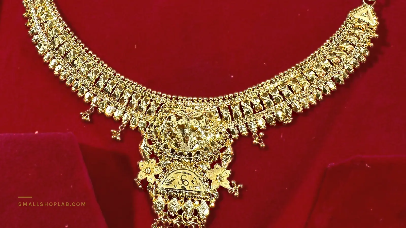
I published two rules for photographing silver: never shoot it on a light background, and shoot it worn rather than flat. One of those rules is wrong for gold. Not slightly wrong — actively harmful, and for a reason that is worth understanding rather than memorising.
Where this comes from, and what I am not claiming
I sell silver jewelry at rupanjalibd.com and gold at swarnanjalibd.com — two shops, same room, same phone, same lightbox. The silver rules came out of a real before-and-after pair from my own listings, and you can see both photographs in two photos of the same anklet.
What follows about gold is reasoning from the same two variables, not a controlled before-and-after pair. I am saying that plainly because the whole point of this site is that the evidence is labelled. I do now have three gold photographs from my own shop, on the same phone, and they are further down — two backgrounds, but three different pieces, so they measure the problem rather than prove a controlled test.
The two variables that decide every jewelry photo
| Variable | The question it answers | Which metal it punishes |
|---|---|---|
| Contrast | Can you see where the object ends? | Silver — it borrows the colour of whatever is behind it |
| Colour accuracy | Is the metal the colour it really is? | Gold — it has a colour to get wrong, and silver does not |
Silver is, optically, a mirror with no colour of its own. On a pale grey background it reflects pale grey, its edges dissolve, and a fine chain simply stops existing at thumbnail size. That is why the fix is a dark backdrop: you are not making it prettier, you are giving it an edge to have.
Gold is a mirror with a colour. Its edges are rarely the problem — put it on almost any background and you can see where it is. What goes wrong is the hue, and it goes wrong in two directions at once.
What inverts
| Silver | Gold | |
|---|---|---|
| Background | Dark — grey, charcoal, deep green | Light neutral — white, bone, pale stone |
| Why | It needs an edge | A dark background makes gold read muddy and brassy |
| Light temperature | Forgiving — it takes the colour of the light | Critical — warm light turns gold orange, cool light turns it green |
| White balance | Set it and forget it | Set it per shoot, against something you know is white |
| On a form or flat | On a form | On a form — this one does not invert |
The trap is that a dark background makes gold look expensive on your screen and wrong in the buyer’s hand. Deep backgrounds push warm metals towards orange, and orange gold reads as brass, and brass reads as fake. A buyer who receives a piece that does not match the photo does not think “my screen is different”. They think they were misled, and that becomes a case, a refund and a hit to the customer-service score Etsy ranks on.
Both of my silver comparison shots came off a phone, using window daylight plus a lightbox and an LED ring light. No camera body, no studio. The difference between the photo that worked and the one that did not was the background and the form — nothing that cost money.
What my own gold photographs measure
Three pieces of gold from my own shop, all on the same phone: a necklace in its red velvet box, a second necklace on a plain sheet of white paper, and a pair of bangles on tissue. They are not the same piece — different items, different days, different light. What they can be compared on is the thing the background decides: what the camera was able to record.
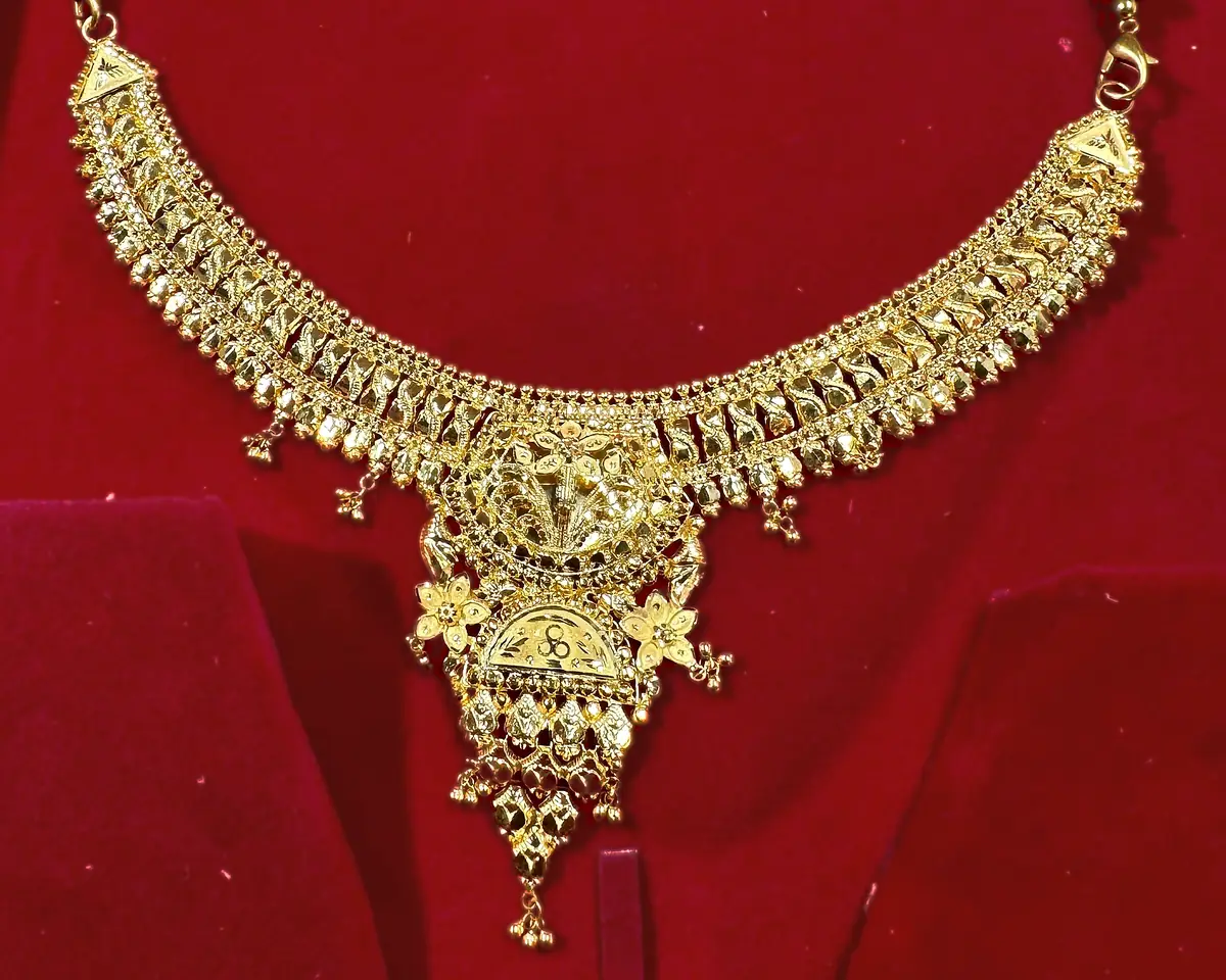
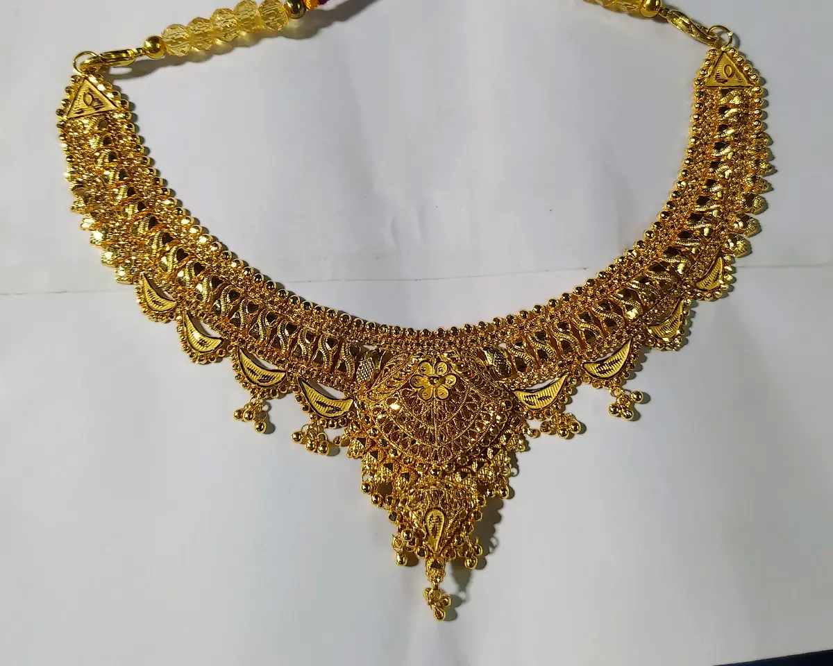
| On red velvet | On white paper | |
|---|---|---|
| Background’s share of the frame | 80.6% | 75.9% |
| Background’s average colour | R 202, G 3, B 8 | R 182, G 187, B 192 |
| Red channel clipped at 255 | 2.4% of the frame | 0.22% |
| Correction needed to make the background neutral | none is possible | × 1.03, × 1.00, × 0.97 |
Read the last row twice, because it is the whole post. On white paper the camera was already within three per cent of neutral, and the three per cent that was left came out in one move. On red velvet there is no such move. Not a harder one — none. The velvet averages R 202, G 3, B 8: green and blue are not low in that frame, they are absent, and nothing anywhere in the picture is a known colour to correct against.
The velvet frame also has 2.4% of its pixels clipped at 255 in the red channel — eleven times the white-paper frame’s 0.22%. Clipped means the detail was never recorded. No editor recovers it later, because there is nothing there to recover.
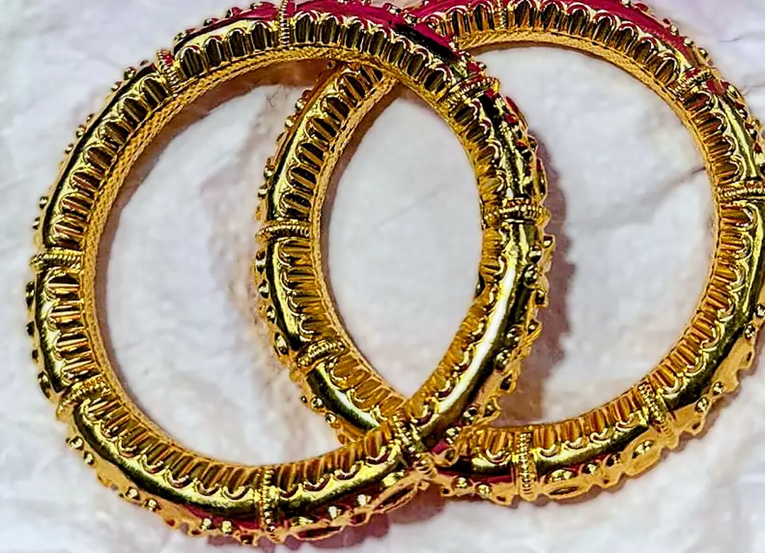
So the argument for a light neutral background is not that gold looks prettier on it. It is that a neutral background is a reference, and a saturated one destroys the reference. An orange cast on the white-paper shots can be corrected in seconds, because the paper says what white was. The same cast on the velvet shot cannot, because nothing in that frame ever recorded what white was. The error is not larger. It is permanent.
A sheet of ordinary white printer paper is the entire fix, and it costs nothing. It does not even have to survive the crop — it only has to be in the frame when the white balance is set. Photograph the piece on paper first, then in the velvet box if the box is part of what you are selling. In that order.
The one setting that matters most for gold
White balance, and it is worth being specific. Mixing light sources is what ruins gold: window daylight is roughly 5,500K, a warm room bulb is around 2,700K, and an LED ring light can be anywhere depending on its setting. Photograph gold under two of those at once and no single white balance can be correct for the whole frame.
- Pick one light source and switch the others off. Window daylight alone is the easiest to reproduce tomorrow.
- Put something genuinely white in the first frame — a sheet of printer paper — and use it to set white balance. Then remove it and shoot the rest.
- Do not correct colour per photo afterwards. A listing with eight photographs in eight slightly different golds looks like eight different products.
What does not change
Scale. It is the question every jewelry buyer has and almost no flat-lay answers. A ring photographed on a hand, an anklet on an ankle or a form, a chain on a neck — that photograph does the work of three paragraphs of description, whichever metal it is.
And the first photo still has to survive being a thumbnail, because that is where the decision to click is made. That is the same for both metals and it beats every other consideration on this page.
Three things to do with this
- Shoot one gold piece on a dark background and a pale one, side by side. Five minutes, one product, and you will never need to be told which is right again.
- Switch off every light except one. Mixed colour temperature is the single most common reason gold photographs badly, and it costs nothing to fix.
- Compare your photo against the piece in daylight before you publish. If the gold in the photo is warmer than the gold in your hand, the buyer will notice — and they will notice after paying.
Setup details are my own, as of 4 September 2026: phone camera, window daylight, a lightbox and an LED ring light. The silver rules are demonstrated by the photograph pair in the linked post; the gold guidance is derived from the same two variables and is labelled as such above.
Questions people ask about this
What background is best for photographing gold jewelry?
A light neutral — white, bone or pale stone. Gold has its own colour, so it does not need contrast to have an edge; what it needs is a background that does not push its hue. Dark backgrounds make gold read orange or brassy, which reads as fake.
Why does my gold jewelry look orange in photos?
Almost always mixed or warm lighting. A warm room bulb is around 2,700K against daylight at roughly 5,500K, and gold amplifies whatever warmth is in the light. Switch off everything except one source and set white balance against a sheet of white paper.
Can I photograph jewelry with a phone?
Yes. Both of the silver comparison photographs on this site came off a phone with window light, a lightbox and a ring light. The variables that decided which one worked were the background and whether the piece was worn — neither of which costs anything.
Should gold be shot flat or on a model?
On a form or a body, same as silver. This rule does not invert. Flat-lay cannot answer the question every jewelry buyer has, which is how big the thing actually is.
Leave a Reply